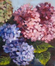
 Sunday afternoon I went to paint again at Barbara's house, and since rain and clouds were predicted, we painted together in her backyard studio, a wonderful screened in patio porch, with the fans going. It was still-life time, and we wound up with hydrangea in a vase. As it turned out, I had just done hydrangeas the day before (see next post), so I had at it. The color in this one is better, but the composition is somehow not quite right. There's just something about it that feels off somehow. Any ideas, Karen, Teri, Jana, Roz, Clare, Sue, Donn, Lin (and any other EDMers) ? Drawing problems keep cropping up, boy do I need practice just plain drawing.
Monday, July 24, 2006
EDM 76 Hydrangea at Barbara's
 Sunday afternoon I went to paint again at Barbara's house, and since rain and clouds were predicted, we painted together in her backyard studio, a wonderful screened in patio porch, with the fans going. It was still-life time, and we wound up with hydrangea in a vase. As it turned out, I had just done hydrangeas the day before (see next post), so I had at it. The color in this one is better, but the composition is somehow not quite right. There's just something about it that feels off somehow. Any ideas, Karen, Teri, Jana, Roz, Clare, Sue, Donn, Lin (and any other EDMers) ? Drawing problems keep cropping up, boy do I need practice just plain drawing.
Subscribe to:
Post Comments (Atom)

4 comments:
OH MY!! GORGEMENTOUS!!! Don't you love painting hydrangeas?!!!! I am such a novice here, Nel ... but I'm wondering if the 'sense' you have about the painting might be that they're a bit 'heavier' on the top than the bottom -- that the weight of the pink blossoms might be heavier than the leaves on the right corner? Guessing here as composition is my challenge too! What happens if you turn the image upside down -- (I know the leaves won't be right) -- but would you get the same 'feel'?
I DO LOVE your work, Nel .. all of it is always so rich and so evocative!
Nel, how gorgeous is this! I especially love the balance of the greenish blossom top left with the leaves bottom right. I love it, sorry, can't offer any critism no matter how constructive. My problem is I'm having absolutely NO luck with the drying of mine for the wedding. So far I've tried just hanging them and letting them soak up some glucose then hanging them but they are shriveling up to nothing! Do they just HATE this heat? Frustrated yet admiring, Sue
Nel, I like it just as it is, I don't think there's a problem with it, really.
It is really gorgeous -- I'm not sure what feels off to you about the composition. It kind of feels like a part of a painting rather than the whole thing -- maybe your lights are leading the eye off of the page, rather than keeping it in? Still, I should have such problems! :-) Again, this is gorgeous!
Post a Comment