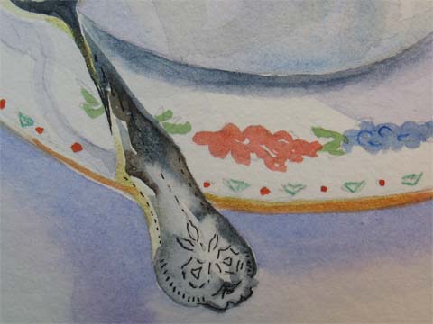
 I know I made the silver spoon too dark, but really don't know what I could have done other than use a lighter value to make it look real. Any ideas out there? Tricks you've used? It just doesn't look silverish, or reflective. What do you think might have worked better? Thanks.
Tuesday, June 27, 2006
Detail of Watercolor EDM 69 Teatime
I know I made the silver spoon too dark, but really don't know what I could have done other than use a lighter value to make it look real. Any ideas out there? Tricks you've used? It just doesn't look silverish, or reflective. What do you think might have worked better? Thanks.
Subscribe to:
Post Comments (Atom)

8 comments:
welcome to EDM - this is wonderful!! I love tea too!
Gorgeous! I love the reflections on the spoon and your composition. Glad you found time to get some painting done!
WOW!! I am so glad you're okay -- life does tend to 'move us off our path' sometimes -- but so glad you're back to painting. This tea cup, saucer, and spoon are AWESOME!!! I haven't a CLUE how to make anything look silver - mine always look GRAY! But these are incredibly well done and beautiful!!! BRAVA!
I have less than a year experience and no formal classes using watercolor, so I can't comment on your relective surface question. however, I wanted you to know that I just looked through your blog and love your work. Please keep sharing with us - hopefully our desire to "see" will inspire you to "do".
But the spoon DOES look silverish and reflective. I think it works very nicely. Thanks for the reminder that a timeout to draw is a good thing.
It looks silverish to me. The only thing I can suggest is the old - the darkest part sits right next to the lightest part. That creates contrast and something for the light part to 'bounce' off. But this is a great painting.
Thanks for visiting my blog. I am linking to yours as I type this...
Nel, I think it has a good silver tone. I agree with Jan on the darkest lightest ... and I think I would have reserved a bit of white here or there for a reflective highlight. it's usually the very sharp highlights that "sell" the shininess. If you're handy at Photoshop, try adding the white on a separate layer on your scan and see what you think.
I just love the light in your creek pictures - beautifully done. And this tea cup has got me gasping to go and put a brew on. Very delicately done. I really can't offer suggestions, being a watercolour beginner.
Post a Comment