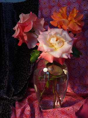
 The following is a short step-by-step of a painting from this photo. It was loaned to me by fellow artist Jana Bouc, http://janabouc.wordpress.com/ and I wanted to see what I could do with it. I know right away that I want to move the position of the drapery, not having it right in the middle of the composition, and I'll also crop in the photo, so the flowers and vase fill up the canvas more. I take some scrap paper and cover parts of two sides, so that I won't see the far edges. I love all the drama in this photo and am eager to get painting.
Friday, September 21, 2007
Jana's Rose Photo and Short Step Process
The following is a short step-by-step of a painting from this photo. It was loaned to me by fellow artist Jana Bouc, http://janabouc.wordpress.com/ and I wanted to see what I could do with it. I know right away that I want to move the position of the drapery, not having it right in the middle of the composition, and I'll also crop in the photo, so the flowers and vase fill up the canvas more. I take some scrap paper and cover parts of two sides, so that I won't see the far edges. I love all the drama in this photo and am eager to get painting.

Sketching the Composition
 I want my vase and flowers to fill up the canvas, so I've cropped the photo by covering part of two sides with scrap paper, and then sketching in thin paint with a lot of OMS. As I correct the "drawing" and wipe off mistakes with a paper towel dipped in OMS, I'm also toning the canvas very thinly with a sienna coating. I already know that to try to make this a tight painting, it will take more time, so I'm going to do this loose and kind of "sketchy," a style I really like to work in. I'm only indicating major lines here, and getting the shapes down quickly.
Step Two Indicate Darks
 I like the drawing now, after "erasing" it with paper towel several times, and changing this area and that. I start by putting in the darks, always the most fragile colors. I'm using alizarin, burnt carmine and some purple madder, keeping these darks very rich.
Drapery Step 3
 Mostly working with darks, deep reds and purples, I paint in the background and the drapery. I like the pattern in the right hand drape, but treat it as dots rather than the more complicated pattern that it is. A couple of quick strokes for the leaves.
Foreground Flower
 I'm satisfied with the background, and have started on the flowers. I like the shape on this one, and have tried to keep it very simple. I am really not trying to make the rose look like the photo, just get a pleasing suggestion of colors and shapes.
Front Flower Detail
 Detail of the front flower, included so that you can see the brush work. I've mostly not blended here, just laid in the colors where they needed to go.
Back Two Flowers
 Working on the two back flowers, the orange one giving me some trouble. It looks too choppy, and doesn't make sense. I go back and forth between the two flowers, trying not to get too
 much mush. The paint is pretty thick, so anything as overlay has to be thick, and carefully applied. The other alternative is to scrape and start again, which is also a perfectly good solution.
Finished Painting
 The finished painting is 10" x 12", oil on Canvas board. Here I've added the edges of the water inside the vase, just a few strokes to suggest, and the highlights on the glass. I finished the last flower and cut back into the edges with the burnt carmine.
Wednesday, August 22, 2007
Starting a Landscape
 Starting a new painting. More acurately, two of the same painting. The following entries are some of the steps I made in the process. It was pretty easy to shoot a photo when I was swapping out the two paintings, using the same colors for each step on the two paintings. This is done with the limited palette I've been using lately from the book, The Yin/Yang of Painting, by Hongian Zhang, who gives three complementary palettes. Of these three: the blue-orange, the purple-yellow, and the red-green, I'm using the red-green palette colors. I'm not really missing the blues and the yellows much any more, since I have turquoise and citron to use.
I sketch out in pencil the basic shapes in the painting. Over this I spray workable fixative. Usually you would tone the canvas once the fixative is dry, but here I just didn't. I block in my darks, and then start carefully mixing my critical colors: the road colors. I paint of bit of my test color on a piece of scrap paper, and hold it right up to the photo. Then I talk to myself, warmer, lighter, more pink, more orange, more purple...til I get it right. The actual colors in the foliage don't matter quite so much, so long as you get the basic values right, but with the road and it's shadows, I want to come as close as I can.
I hope that you enjoy the following posts. The two finished paintings are posted today on my painting blog, Nel's Everyday Painting. The link is listed in the sidebar. Thanks for looking.
Step Two
 I paint in the dark areas that I see first. I just mix some darks together, trying for a deep warm color. Not too much blue, that will make the tone of the shadows really cool. Mostly this is quite thin, so it will dry and I can paint right over it.
Step Three
 I paint in the darker areas of the road shadow. You could do the road one of two ways, either consider the road as dark and paint the light spots over top of the dark edges of the spaces, or consider the road as light, and paint the light spot first, and the darker shapes to overlap on top of the lights. Either way, the effort is to keep the two colors pure right now, and not intermix them too much, which would lose both the power of the dark and the punch of the light.
Step Three
 I mix a very light sky color, starting with white and then adding teeny bits of magenta and blue, and I mean tiny bits. You want the sky to be (most of the time) your lightest area, and it's surprising how light it can be, how little color you need to make it work. I don't touch the other colors with my sky color yet.
Step Four
 Blocking in the background grey and the light lavender of the sky. I paint almost up to the tree edges, but don't want to pick up any extra color into my sky color. I've also put in the second road color here, and some darker lines for the ruts in the road. These rut lines will help break up the horizontal shadow shapes and give more of a suggestion of road. There is still a bit of blending to do, since you want the road to "lay down" flat as one unit. Flattening the texture and easing the edges will help. I won't do too much blending right here, since the addition of the middle ground colors will detract from all this action.
Step Five

 Road light colors and starting to blend them together. Also here I am doing some finish work on the background greyed area. I want it dark, but also light enough and "blued" enough to show distance. I also want to suggest a warm light back there on the tree tops with some citron color. Theres a lot of blending and then repainting, working it back and forth.
Step Six
 Now the lighter edges of the road side. These are a mixture of white and citron yellow and some cinnabar green light (one of my favorites). I use a little of the road color for the continued shadow from the road into the grasses. Now I can also judge and refine the depth and value of the greyed area of the background. It's pretty close, but I can see where a little more darkness underneath the tree tops back there would help.
Step Seven
 The basic dark shapes of the tree trunks go in here. I've mixed burnt sienna and ivory black for a really dark color. Pure black might be too dark, looking like a cut out hole instead of a trunk. I'll work around and over the top branches.
Step Eight
 I cover the remainder of the white canvas now with thin mixes of mostly burnt sienna (the orange you see here is b.s. thinned up) keeping the coverage even thinner where I'll have lighter colors over top. The burnt sienna sometimes shows through the green foliage and makes a nice complement. This coat can dry quickly and then I can paint the mid ground.
Step Nine
 The greyed background, the road edges and the road are all pretty much done. I'm working my finishing from the background forward here. I finish up the trees (birches) on the left side of the road top. I work from the edge towards the left side, blending from the dark into the light. Then I'll do finishing work on the middle ground and the foreground.
Step Ten

 Using a rigger brush, I put in the treetops of the birches, then daub some of the road color into the lines, just lightly. This is done right on the dry canvas (actually it should have been toned first, but...) Over the sky the lines would have lost their thin darkness. This way I can go back in and paint the sky holes right up to the colors and lines.
Step Eleven
 Refining the Middle Ground. Adding swashes of green overtop what's already there. Some turquoise to cool the middle ground but give it some shapes. Further definition of the greens in the foreground. What I've found with oils is that you can plan on the layers. You know that you'll have a leaf clump in a certain spot. You can first put a mid or a dark down thin for the lighter leaf clump to sit on top of.
Subscribe to:
Posts (Atom)

