Sunday, February 11, 2007

Kate's Online Class


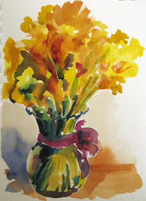
Been awhile since I posted here, been so busy fretting about a major move and keeping up with the daily painting. Did sign up for Kate's online watercolor class (Kate Johnson, for those of you not in EDM) and it's made me jealous to work in watercolors. So last night, after I finished the painting for the day, I got out the watercolors and had some fun. It is a touchy medium, but when you get a good result, it's such a joy. I had a student once who always said "Even a blind squirrel gets a nut once in awhile!" so there's the mantra for doing watercolors.

Thanks for looking.


Saturday, February 03, 2007

All Done with Cherry Pie Painting


This is a small "tutorial" of sorts, to show the process I mostly use for a still life painting with a set up. I couldn't think backwards, so you'll have to scroll down to the post that says, Beginning, and then go in reverse order to actually see the progression. Sorry about that. Now that I see this posted, I can tell that I still need to blend in that small spot of reflected orange light in the green shadow. For the rest though, I will call it done. The highlights on the cherries are added, and the blending is completed. Thanks for looking, hope you enjoy the mini explanation.

Filling Next


Blending and defining. I have finished the filling block in, so now I can start refining, which is another word for fixing, LOL. Putting in more yellow where the crust seems too cool, adding darks into the filling where the crust needs to be highlighted more. I have also fixed the shape of the left side of the pie where it looked too fat. I also did some corrections in the shadow shapes in the interior curve of the plate. It's getting there.

Crust Painting


I've blended some in the plate, and started correcting the drawing problem in the top curve of the right side of the plate. I get up often and walk away so that I can get a better overall look, spotting the problesm that way. There is a shadow behind the pie crust, but I overshot it here and will have to pull it back, more to the left, with that dark green color. I see a small bit of reflected light in the pie shadow falling on the plate, so I put that in. Just laying in the colors of the crust, and starting to put in the reds of the filling.

More Plate and Background


Filling in the plate colors and the little wood color table edges. Now the plate really shows up lopsided, and I'll need to fix that soon. Some of the shadows in the plate are more defined here also.

Plate and Background, another Easy Shape


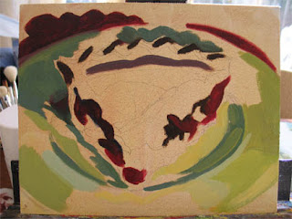
To see the plate shape even better, and because the background is another pretty easy shape, I paint in the red background. I chose the red paper in the background to go with the cherry fillling and because it is the complement of the green in the plate.

Start with the Easiest Shape and Color


Since I have the plate colors already pre mixed, and it's pretty easy to "see" those colors and shapes, I start filling them in. Without worrying about blending, I just pick up paint, lay it in, and if I'm switching colors, I wipe my brush between strokes, to keep the color clean. See how the plate drawing errors are now visible (on the right) ?

Start with the Darks


While the tone is drying, I pre mix some of the colors I see. Here I have a green for the base color of the plate, some blue green for the shadows on the plate, and a more yellowish green mix for the very light spots on the plate. When the tone is dry, I start with the darks. This is mostly a mix of alizarin and sienna and ultramarine. The really dark darks are the most fragile, they get diluted the most quickly and then lost, so I paint them first, and try to be as accurate as possible. Some of the other deep darks are alizarin and pthalo green, which is almost a black.

Tone the Canvas


With a very diluted mix of OMS (Odorless Mineral Spirits) and some burnt sienna paint, I brush on a tone to get rid of the white of the canvas. You can use ochre, or red. Rub with a paper towel or rag to spread the tone evenly. You can see that the pencil sketch still shows through. The purpose of the tone is to give you a midtone color, which you can then judge your colors against, more easily than white. Also if you miss a spot here or there, you still have a midtone underneath.

Beginning a Painting


Beginning a small painting. Still life set up with light for shadows and highlights. I am going for the strong values, so a light helps. Using a small canvas (8" x 10" here) I draw out the set up, as carefully as I can. Struggle with the drawing. Richard Schmid says that this is critical as a backbone, that many painting problems are actually drawing problems. I won't be able to actualyy "see" many of the drawing problems until the masses get on the canvas, but I try for a good drawing. I just use pencil, then spray (outside) with a workable fixative to avoid getting the graphite into the paint.
Related Posts with Thumbnails