Monday, December 24, 2007

Large Painting in Acrylics


Valley with Cows, and Details.
This painting is the finished piece which I posted as a work in progress several days back. The painting is fairly large, 22" x 28", and I'm pretty happy with the results. Getting used to the acrylics by painting and painting and painting.

Sunday, December 23, 2007

Chroma Atelier Interactive Acrylics


I've been working with the acrylics now for about a week and a half, and doing as much practice and research as I can. The above are several winter paintings I've finished with the Interactives this week. Blending is the hardest thing to adjust to with the acrylics, and I've found some really good information on techniques on Wet Canvas. Now www.wetcanvas.com is huge, enormous. And I've gone there a couple of times without any luck (high levels of confusion and frustation), but somehow I stumbled on a good resource this time around. It's the Information Kiosk under Acrylics, and inside the Kiosk is a nice list of "classrooms" that you can visit and read. All different topics. Here's the link to the Kiosk: http://www.wetcanvas.com/forums/forumdisplay.php?f=329 I think it'll work. From there you can pick a class to visit. The one on blending techniques helped me enormously. Also the one on glazing.

Today I mixed "slow" which is a medium for slowing down the drying time of the paints, and also some Gel Pumice (it was a Golden sample I had gotten at an art store and saved), and the combination gave me extended time and some extra heft and tooth to the paint. I used my water sprayer some but not as much, mostly to spray the palette, not the painting. And I scrubbed when I wanted blending with a damp, clean, bristle brush and found the blending easier to manage.

For the small branches and trees I used some "Liquifier," another Chroma product for their Interactive line, and that not only thinned the paint, but it (somehow) kept it from turning transparent (as you'd expect.) I was able to get thin, solid lines with a rigger brush to add branches to the trees (bottom two paintings.)

And there's my update for the Interactives. I'm starting to get the hang of it. You really do have to stay with it, and get past the frustration at the beginning. Working WITH the paint is the trickiest part, but the mediums really help you out.

Wednesday, December 19, 2007

More on Chroma Interactives

This post continues to document and make comments on my experiments with Chroma Atelier Interactive Acrylics. I was able to manipulate the paint to do this small (5" x 7") landscape today, and start on a larger painting to see how big I could go. See below.


This one in a larger canvas, 22" x 28", and the second photo is a detail. I wanted to practice larger work, in preparation for a wall mural that I'll be working on in January. I think that once I have some of the technique figured out, I'm going to really like these paints. I have to undo the habit from oils of holding a paper towel in my left hand, for wiping my brush, and replace it with a spray bottle of water. As long as you keep spraying, you can keep blending. I'll work more on the sky on this one, to see what I can learn about manipulating the paint. But I was pretty happy working with these today (now that I am figuring out about the water spray.) I still need to figure out brushes, since the bristle brushes I'm using from oil work (my old ratty ones) get thick and gunky pretty quick, and I have to work to get them clean in the water.

More as I learn it.

Monday, December 17, 2007

Interactive Acrylics Day Two

I am glad to report that using good watercolor paper makes a real difference in the results with the Atelier Interactives. They merge easily, and wet-in-wet works really well also. Bleeds, gradations and dry brush are also good possibilities. Now I'm eager to try a "real" watercolor with these. I think the only real adjustment will be that I'm used to a palette with dry paint that can be "awakened" with water. These, obviously, need to be used while they are fresh.


Winter scene with detail. Acrylic on cardboard coated with Gesso. I added a whole bunch of "Slow" medium to my colors (about ten drops to each 1/2" squeeze) , which made them able to rewet with the water sprayer. This gave me a lot more control. The mountains blended a little, but I hadn't sprayed them as I went. The sky blended better, with spraying right on the board. There is a yellow undercoat on the sky, which I let show through in spots, then added more white to the clouds. It worked nice for subtleties. The treetops are fan brush with somewhat dry paint.

We're getting there!

Report on Interactive Acrylics


Chroma Atelier Interactive Acrylics.
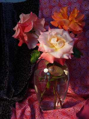
I have been shopping for acrylics, in anticipation of a mural I will be working on ( on four walls) in January, and decided to try the Interactives. These acrylics are advertised as being the most like watercolors, used very thin, and oils, very blendable. It sounded like the best of both worlds. So I got them yesterday, and after finishing and posting my painting for today AND cleaning my brushes, I got them out to play. The colors are strong and clean. The color chart was done on really poor watercolor paper, and I will try them on some decent paper, but I think they'll be fairly like watercolors. On this paper, thinned with a lot of water, they acted like watercolor, but lost their strength. Used more thickly, they felt a little "slimey" to me. I'll let you know what I think with better paper. I tried some wet on wet, and the colors will run together, but since it's a different medium, it really won't act exactly like watercolor.

On to a painting, using them like oils.
There are a lot of different mediums to use with this paint. The full line can be found on the web site, here: http://www.chromaonline.com/chroma/

I think once I play with them, and figure out what they do, I'll be able to do some blending. I could only blend when the paints were truly fresh, and was shy about using too much of any of the mediums. I did pop a little of the "Slow" into my blue mixes for the water, and that helped, but I probably didn't add enough, because I found it tricky. The painting is below.

I'm excited about the new paint, and have enjoyed it so far. Taking into account that this is my first play time with them, I am pleased with the results. I'll keep you posted.
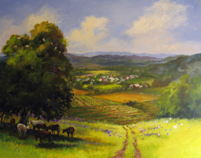
End of Day One with Interactive Acrylics

The Color Sketch, beginning stages, above. I used a regular canvas panel from Ray Mar, and decided later that it would have been better had I followed the directions and used a Binder to cover the canvas first. I'll try that on the next canvas and let you know how it differs. The sketching was fun, paints were fresh and soft, and I could use water as if it were OMS for oils, and paint fairly transparently. The build up was nice, as the first layer would dry quickly and I could paint overtop with subtle variations of color in the same value. Color mixing was pretty much as I expected, although I missed a really deep color. The ultramarine wasn't as dark as I'm used to. (I'll have to order some darks.) I did miss being able to blend, and you are supposed to be able to, but I haven't figured out the mediums yet. I did try the "Unlocking" formula, and added it to my water mist bottle sprayer, but when I sprayed it on the area, all it did was take the color right down to canvas again. I guess that's what it's meant for. Now I know. I will try the "Slow" medium tomorrow, see if that makes blending doable.


This is the painting as I leave it tonight. I want to see tomorrow if the color will still soften after drying overnight. I'm still getting used to how the color piles on the palette act, and how long I can use them before they get dried out. What the mister will do. And whether I dare mist right on the painting. When I broke for dinner, the piles on the palette skinned up. My mixing areas would reconstitute somewhat, but there were little bits of dried color skin in them then. I could still peel the skin off the piles and use the color underneath. This paint is great (so far) for:

layering, scumbling, fresh clean color areas (no cross contamination), easy clean up, glazes

Hopefully, I can tell you more tomorrow.


Friday, December 14, 2007

Ackerman Pump Pen

Ackerman Pump Pen, the nib is a Hunt 101.

The Ackerman Pump Pen, a wonderful new toy! This is a very versatile pen, and can be fitted with a whole bunch of different art nibs. I bought the Gen 3, and this one has a Hunt 101 nib in it. It is a NOT fussy pen, and is supposed to accept all types of ink, acrylic, gouache, watercolor. Right now I have Noodlers Ink in it, and it works beautifully. I haven't exactly figured out the pump yet, (you can see the little oval pump in the barrel above) but what a fine new toy! Here's a portion of a little piece I played with while watching TV the other night:
It gives a very fine line, nice for hatching, but with a little pressure, you can also get a stronger line, and with pressure you can vary them in the same line. You can, of course, change the nib out any time. I know you can get these nibs in most fine art stores, or order various separtae nibs from Ackerman's. I tried writing with it, and that works just fine.
And here's the link, if you want to check it out:


Sunday, October 28, 2007

New ET Series

Above:
Autumn Serene, Oil on Canvas board, 12" x 16", from my own photos, for sale on my painting blog, Nel's Everyday Painting (see side bar.)


A new painting book is a wonderful treat, and I got one by a painter I greatly admire. It's called Oil Painter's Solution Book: Landscapes, by Elizabeth Tolley, whose work is just beautiful. This is a terrific book, and I think I'll be working from it for awhile, I like her colors and techniques so much. I did two exercises that turned out well enough to give as gifts, above. Then I tried one from my own photos from this past week, to see if I could use some of the color mixes and techniques, and that too, turned out remarkably well. It's a jump for me into wonderful new territory, so I wanted to recommend the book to anyone looking to improve their oil techniques.


Friday, September 21, 2007

Jana's Rose Photo and Short Step Process

The following is a short step-by-step of a painting from this photo. It was loaned to me by fellow artist Jana Bouc, http://janabouc.wordpress.com/ and I wanted to see what I could do with it. I know right away that I want to move the position of the drapery, not having it right in the middle of the composition, and I'll also crop in the photo, so the flowers and vase fill up the canvas more. I take some scrap paper and cover parts of two sides, so that I won't see the far edges. I love all the drama in this photo and am eager to get painting.

Sketching the Composition

I want my vase and flowers to fill up the canvas, so I've cropped the photo by covering part of two sides with scrap paper, and then sketching in thin paint with a lot of OMS. As I correct the "drawing" and wipe off mistakes with a paper towel dipped in OMS, I'm also toning the canvas very thinly with a sienna coating. I already know that to try to make this a tight painting, it will take more time, so I'm going to do this loose and kind of "sketchy," a style I really like to work in. I'm only indicating major lines here, and getting the shapes down quickly.

Step Two Indicate Darks

I like the drawing now, after "erasing" it with paper towel several times, and changing this area and that. I start by putting in the darks, always the most fragile colors. I'm using alizarin, burnt carmine and some purple madder, keeping these darks very rich.

Drapery Step 3

Mostly working with darks, deep reds and purples, I paint in the background and the drapery. I like the pattern in the right hand drape, but treat it as dots rather than the more complicated pattern that it is. A couple of quick strokes for the leaves.

Foreground Flower

I'm satisfied with the background, and have started on the flowers. I like the shape on this one, and have tried to keep it very simple. I am really not trying to make the rose look like the photo, just get a pleasing suggestion of colors and shapes.

Front Flower Detail

Detail of the front flower, included so that you can see the brush work. I've mostly not blended here, just laid in the colors where they needed to go.

Back Two Flowers

Working on the two back flowers, the orange one giving me some trouble. It looks too choppy, and doesn't make sense. I go back and forth between the two flowers, trying not to get too
much mush. The paint is pretty thick, so anything as overlay has to be thick, and carefully applied. The other alternative is to scrape and start again, which is also a perfectly good solution.

Finished Painting

The finished painting is 10" x 12", oil on Canvas board. Here I've added the edges of the water inside the vase, just a few strokes to suggest, and the highlights on the glass. I finished the last flower and cut back into the edges with the burnt carmine.

Wednesday, August 22, 2007

Starting a Landscape

Starting a new painting. More acurately, two of the same painting. The following entries are some of the steps I made in the process. It was pretty easy to shoot a photo when I was swapping out the two paintings, using the same colors for each step on the two paintings. This is done with the limited palette I've been using lately from the book, The Yin/Yang of Painting, by Hongian Zhang, who gives three complementary palettes. Of these three: the blue-orange, the purple-yellow, and the red-green, I'm using the red-green palette colors. I'm not really missing the blues and the yellows much any more, since I have turquoise and citron to use.

I sketch out in pencil the basic shapes in the painting. Over this I spray workable fixative. Usually you would tone the canvas once the fixative is dry, but here I just didn't. I block in my darks, and then start carefully mixing my critical colors: the road colors. I paint of bit of my test color on a piece of scrap paper, and hold it right up to the photo. Then I talk to myself, warmer, lighter, more pink, more orange, more purple...til I get it right. The actual colors in the foliage don't matter quite so much, so long as you get the basic values right, but with the road and it's shadows, I want to come as close as I can.

I hope that you enjoy the following posts. The two finished paintings are posted today on my painting blog, Nel's Everyday Painting. The link is listed in the sidebar. Thanks for looking.

Step Two

I paint in the dark areas that I see first. I just mix some darks together, trying for a deep warm color. Not too much blue, that will make the tone of the shadows really cool. Mostly this is quite thin, so it will dry and I can paint right over it.

Step Three

I paint in the darker areas of the road shadow. You could do the road one of two ways, either consider the road as dark and paint the light spots over top of the dark edges of the spaces, or consider the road as light, and paint the light spot first, and the darker shapes to overlap on top of the lights. Either way, the effort is to keep the two colors pure right now, and not intermix them too much, which would lose both the power of the dark and the punch of the light.

Step Three

I mix a very light sky color, starting with white and then adding teeny bits of magenta and blue, and I mean tiny bits. You want the sky to be (most of the time) your lightest area, and it's surprising how light it can be, how little color you need to make it work. I don't touch the other colors with my sky color yet.

Step Four

Blocking in the background grey and the light lavender of the sky. I paint almost up to the tree edges, but don't want to pick up any extra color into my sky color. I've also put in the second road color here, and some darker lines for the ruts in the road. These rut lines will help break up the horizontal shadow shapes and give more of a suggestion of road. There is still a bit of blending to do, since you want the road to "lay down" flat as one unit. Flattening the texture and easing the edges will help. I won't do too much blending right here, since the addition of the middle ground colors will detract from all this action.

Step Five


Road light colors and starting to blend them together. Also here I am doing some finish work on the background greyed area. I want it dark, but also light enough and "blued" enough to show distance. I also want to suggest a warm light back there on the tree tops with some citron color. Theres a lot of blending and then repainting, working it back and forth.

Step Six

Now the lighter edges of the road side. These are a mixture of white and citron yellow and some cinnabar green light (one of my favorites). I use a little of the road color for the continued shadow from the road into the grasses. Now I can also judge and refine the depth and value of the greyed area of the background. It's pretty close, but I can see where a little more darkness underneath the tree tops back there would help.

Step Seven

The basic dark shapes of the tree trunks go in here. I've mixed burnt sienna and ivory black for a really dark color. Pure black might be too dark, looking like a cut out hole instead of a trunk. I'll work around and over the top branches.

Step Eight

I cover the remainder of the white canvas now with thin mixes of mostly burnt sienna (the orange you see here is b.s. thinned up) keeping the coverage even thinner where I'll have lighter colors over top. The burnt sienna sometimes shows through the green foliage and makes a nice complement. This coat can dry quickly and then I can paint the mid ground.

Step Nine

The greyed background, the road edges and the road are all pretty much done. I'm working my finishing from the background forward here. I finish up the trees (birches) on the left side of the road top. I work from the edge towards the left side, blending from the dark into the light. Then I'll do finishing work on the middle ground and the foreground.

Step Ten


Using a rigger brush, I put in the treetops of the birches, then daub some of the road color into the lines, just lightly. This is done right on the dry canvas (actually it should have been toned first, but...) Over the sky the lines would have lost their thin darkness. This way I can go back in and paint the sky holes right up to the colors and lines.

Step Eleven

Refining the Middle Ground. Adding swashes of green overtop what's already there. Some turquoise to cool the middle ground but give it some shapes. Further definition of the greens in the foreground. What I've found with oils is that you can plan on the layers. You know that you'll have a leaf clump in a certain spot. You can first put a mid or a dark down thin for the lighter leaf clump to sit on top of.

Finishing Touches

I can put in the hard edged groups of top layer leaves now, and some little touches of white and tiny dots of red and orange. A few branches with the rigger brush, and adding color here and there for balance. And this one's done!

Wednesday, August 08, 2007

New Painting

This painting has posted in it's finished form on my Nel's Everyday Painting blog, but I took some progression shots of it as I was painting. This is not actually the beginning. I've painted in the drawing pretty loosely, and started with the arms. Pencil work for the lines, where they need to be straight. Originally I had her glasses on, but left them out for the rest of the painting (by Alex my granddaughter's request.) There are some drawing problems which will be addressed: the tilt of the ear, the length of the forward leg, the height of the back shoulder. The size is 18" x 18", done of my granddaughter. Photos taken on the front porch yesterday morning, while she was having her cereal. Progression photos follow. Thanks for looking.
Pretty early in the painting. The drawing feels pretty good, except for the back shoulder being too high, and the leg being too short, which I can't see at this stage. I'll fix it later when I spot it. Still really drawing with paint here, working on the face.
Close Up. Sometime I'd like to be brave enough to stop right here, and call it done. Isn't there something so compelling about an unfinished piece?
Shirt and pajama bottoms here. The ear needs fixing.
Working the Figure. Back and forth, pajamas and shirt. You can see a late stage drawing correction in the closest leg. It wasn't long enough, so when I turned the painting and the photo upside down, I could see where the new line should be. I've started painting in all the lines in the background. Basically working from the figure outwards.
Related Posts with Thumbnails