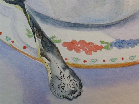
 I know I made the silver spoon too dark, but really don't know what I could have done other than use a lighter value to make it look real. Any ideas out there? Tricks you've used? It just doesn't look silverish, or reflective. What do you think might have worked better? Thanks.
Tuesday, June 27, 2006
Detail of Watercolor EDM 69 Teatime
I know I made the silver spoon too dark, but really don't know what I could have done other than use a lighter value to make it look real. Any ideas out there? Tricks you've used? It just doesn't look silverish, or reflective. What do you think might have worked better? Thanks.


Tea for Mieke: EDM 69
 Sometimes our kids know what we need even better than we do. My daughter was kidding around on the phone today, telling me she was sick of looking at the front porch(last post in early June), and that I needed to sit down and draw. She was more right than she knew. I have been "spring cleaning" in a way, in order to move my studio into a bigger room, yanking up old carpet, washing windows, floors, walls, and the things I'm moving as I go. It's been...mumble mumble...a long time since I really cleaned my studio equipment. (When was the last time you wiped down your electric pencil sharpener with Mr. Clean? Yeah, me too!) And I really DID need to just center, sit and draw. So here's challenge number 69, draw a beverage. The cup and saucer are from a set of six Ansley cups that my mother treasured and enjoyed using, and the silver spoons (the real kind that get hot when you stir your tea) belonged to my grandmother, very beaufiful things, and interesting to watercolor. They will go to my daughter someday. The drawing angle was off, I should have tilted up my sketchbook more to be at the right angle to my line of sight. And the ellipses are a bit "off," as are the values...white porcelain that reflects is tricky, but by and large, I'm happy with the sketch. If anyone's done reflective surfaces, and has hints, I'd love to hear them...silver, liquids, porcelain? Thanks in advance.
Sunday, June 04, 2006
Front Porches
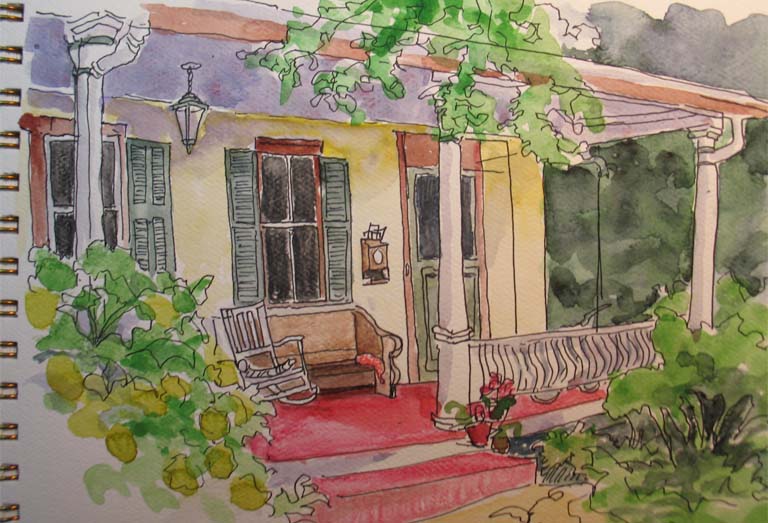 There are a couple of wonderful streets in old town Gaithersburg, where the homes are all different and most are Victorian looking, and every single one of them has its own charm. The front porches are so inviting, and most of the yards are filled with flowers. It's a great place to wander and take pictures. This is a little sketch with marker and watercolor, just because it's fun to play.
Friday, June 02, 2006
Caroline's Permission
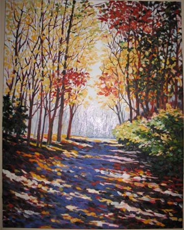 Caroline Jasper is one of my favorite painters, and a lovely human being and teacher to boot. Since I've decided to take oils back up, I have begun by simply copying the work of some painters that I like, Caroline among them. This way the composition is worked out, and I can concentrate on technique and color mixing, rather than having to be concerned with everything at once. I recently finished a very "growing" painting copied from one of Caroline's pieces. (In that, I feel like I learned a lot.) The paintings that I copy I give away, and sign them with my initials and after that "after Caroline Jasper" (or whoever) right on the front. This way the artist is given credit, and the recipient is happy too. In this case, my son, who likes the way this one turned out. I wrote to Caroline, and she gave me permission to post this for you. Here is the URL to her web site and this particular painting, which is really a neat piece called Trail Lights: http://www.carolinejasper.com/P1_landscps/trllghts.htm, so you can see her original. Her book is wonderful also, which is posted here on her site: http://www.carolinejasper.com/. Enjoy!
Same Photo with Pitt Brush Pens
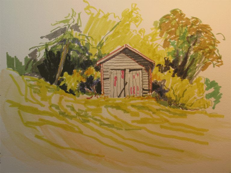 Love the new Pitt Brush Pens! This is the same image as previously posted Graphitint landscape. The quote I wrote in the margin was "Color gets all the glory, but value does all the work!" I'm not sure where I read it, but I am convinced it's true. So much hinges on using good value, creating a value path. Good darks flowing thru the work. Thanks for looking.
Illustration Friday Cake
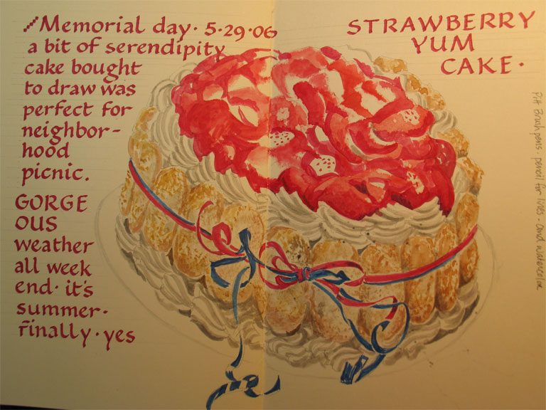
Decided to buy the most complicated cake I could find to draw, and it turned out to be a hit to eat as well. The perfect contribution to a neighborhood picnic. Done with watercolors and Pitt brush pens in the Moleskine sketchbook. I really like these challenges. Can you tell it's ladyfingers on the sides?
Sunday, May 28, 2006
Pink or Yellow on Top?
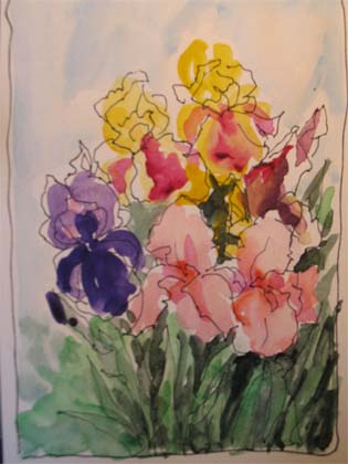 I am working on an oil painting layout, and I could use your input. My friend Jill has some wonderful irises in her garden, which I went and photographed. I am planning a painting for her, and she requested that I include all three colors of the flowers she has. Okay, it's a challenge, but with some planning, I'll tackle it. I am not sure which looks better, the yellow irises on the top of the layout, or the pinky-salmon ones on top. I think the yellow would show up well against either a pale blue sky or the dark of the leaves. Mid tone behind the dark purple petals to make them come out. But I'm waffling between the two layouts. Scroll down to see the first layout, and the thumbnail sketches. Let me know what you think? or any comments, for that matter. (Except the comment that goes, like the "enemy," "Oh, Nel, just scratch the whole thing, you are kidding yourself!") I do plenty of that myself, don't you?
First Color Addition

Adding color to the layout, with the use of the three different irises. Pen and ink addition to work with the shapes of the flowers and buds, and to see about the leaves, mids and darks placement.
Sketches Irises
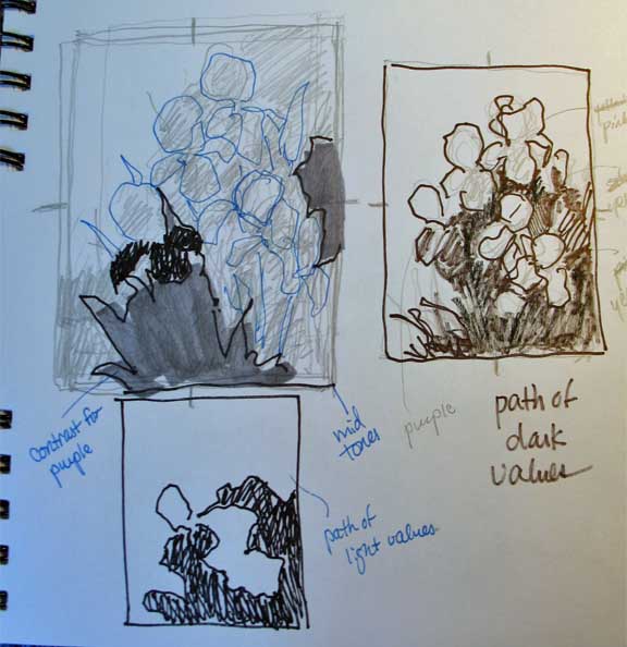 This is thumbnail play, though there were a few rough rough sketches prior to this. I worked on a value path of darks and the placement of lights and midtones.
Saturday, May 27, 2006
Face Stands Alone
Today Molly the puppy will be leaving us. That makes nine out of ten pups sold. The only one left is Mr. Scarface, or Face. I've been trying to sketch the pups as they sleep, the only time they are still enough to draw. This is done in the little Moleskine sketchbook, no erasing, in marker. Of course the angle is a bit odd, since I was looking down on him.
Iris Days
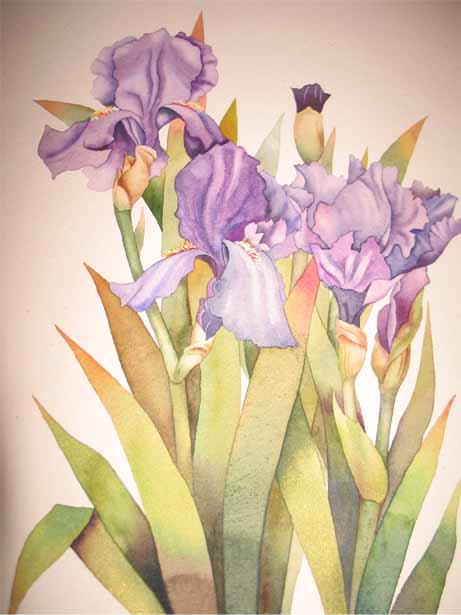 I absolutely love irises. My favorite flowers of all, though there aren't many I don't like. Begonias are on that short list. It's been iris time in Maryland the last several weeks, I think the short blooming time also makes them so precious. I haven't managed to get out and paint any this year, but I have stopped and knocked on doors and taken pictures in people's gardens. Don't you adore the colors? They are so showy and elegant, delicate petals, but bold colors and shapes. I spent a couple of hours last night printing out a bunch of photos to work from in oils. But wanted to celebtrate the special time of spring with an iris posting. This is a medium sized watercolor from last year, but it's my way of marking this wonderful stretch of beauty. Thanks for looking. Happy irising!
Thursday, May 25, 2006
Marker Problem Solved
The last four drawings I've done with marker  (yikes, no erasing) and ink, have been dismally awful, so I've painted over them with ground. The problem is the fear, I think, of not being able to go slowly and make changes. Plus a lack of skill. The lines are just so final. So I'm going to do blind contours for awhile, and don't mind the drawings at all. They look just like they should. This one of my clip fan I actually like, may have to do something funky with color on top of it. Maybe once I get some confidence going, I can attempt some real sketches of people (which is what I had to cover over) or just keep practicing, but in a less "precious" sketchbook, where I can leave the bad drawings, or tear them out.
 (yikes, no erasing) and ink, have been dismally awful, so I've painted over them with ground. The problem is the fear, I think, of not being able to go slowly and make changes. Plus a lack of skill. The lines are just so final. So I'm going to do blind contours for awhile, and don't mind the drawings at all. They look just like they should. This one of my clip fan I actually like, may have to do something funky with color on top of it. Maybe once I get some confidence going, I can attempt some real sketches of people (which is what I had to cover over) or just keep practicing, but in a less "precious" sketchbook, where I can leave the bad drawings, or tear them out.
Brookside Gardens
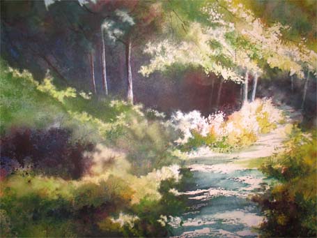 Well, goodness, I guess I'm getting better at this photo reducing stuff. (Of course, by tomorow night, I'll have forgotten what it was exactly that I did.) This was a path through Brookside Gardens, around the little lake there. I hope to go back this weekend (three whole days, YAY!) and paint there again. The flower gardens are wonderful. A sun-dappled path, I had to do a lot of erasing to get my whites back, even though I had sprayed frisket over much of the leafy area first. The tree trunks are also done with Exacto and electric eraser. Full sheet of softer paper-Strathmore Gemini cold press. Thanks for looking.
Another Creek
 This was a very sun dazzled scene, deep shadows, and the sunlit colors washed out. I tried to get the yellow quality of the slow-moving creek water. This creek is in Hillandale, Maryland, where my nephews spent many happy and grungy hours, and coming back to Mom's house was a hard, sweaty climb up an endlessly steep hill. (Me, too, after photographs.)
Watercolors Creek
 I wanted to post a few of the creek series of watercolors. They are actually large 22 x 30, full sheets, mostly Arches 300 lb rough. See what you think.
The sparkles in the water were done with scraping and the electric eraser.
Wednesday, May 24, 2006
The Second Small Landscape
Here's the second landscape that I couldn't upload last night. I guess it was too big, this photo stuff is all an awkward trial and error for me. Did you read the post on Danny Gregory's site today? So true, all this blogging and surfing is important and fun, and interactive, but like everything else, it takes time, time away from other things, like my time in the studio. I imagine that the more you do it, the quicker you get. There's always a learning curve with any new venture, but the point is moderation. And keeping priorities straight (always a trick). I want to share, but also to make sure I have creative time for my spirit, my heart. I think the post is worthwhile reading. The fan Danny draws is also a wonderful thing to see. I will try to add the link here.

Tuesday, May 23, 2006
Two Small Landscapes
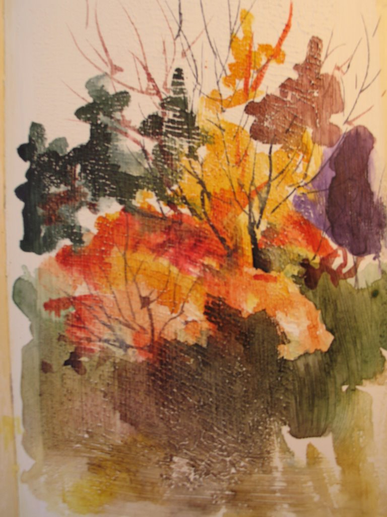 Two small landscapes done on the Moleskine covered with Golden Absorbant Ground for watercolors. It seems similar to Gesso, but thicker by a bit. The two pages stuck together before they were dry, so I got some stick-together texture, which turned out okay. It shows up as little white streaks here. A little serendipity which I might do on purpose next time.
Graphitint Landscape

There's been so much talk lately on the EDM blogs about the Derwent watercolor pencils called Graphitint, so being an art supply junkie, I had to find some too. This is my first try with the pencils and water, and it's the colors. The colors are so suited to subtleties, so suited to landscapes. Very subdued colors, in this set anyway. I like them, I like them, don't give them to Mikie. (Oh, dear, guess I'm showing my age wth that little reference, but what the hey, right?) I did the drawing from a photo I took last summer.
The Fire Hydrant
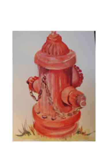
My first entry into the watercolor Moleskine, which feels so tiny to me. But it was fun, I took my stool and one of the dogs outside, and plopped myself down, and just started with color. Normally I would have done some pencil work first, but the little watercolor kit I brought with me didn't have a pencil, so there you go. It's an Everyday Matters challenge piece, I forget the number, maybe I'll have to start notating that in my margins. Yeah, there's an idea. Anyway, Chaos (the pooch) thought it would be especially cool to sit right between me and the hydrant, maybe because it's one of his personal favorite places, so it was a challenging experience. Thanks for looking.
Mother's Day Challenge

A quick painting of the dying bouquet that my lovely daughter sent to me for Mom's Day. It was a lovely Hallmark set from the Marjolene Collection. The vase turned out too dark, so I tried to correct it with some gouache overtop, which wasn't very successful. Done in the Moleskine sketchbook.
Subscribe to:
Posts (Atom)

