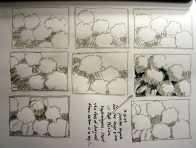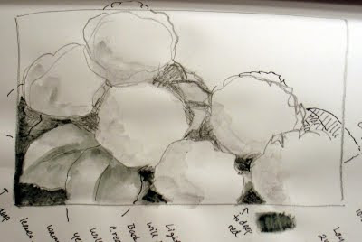
 I don't always do as I teach, but when it's a large painting, I do feel that thumbnail sketches for layout and composition are highly in order. It gives you a map anyway. The painting will be a large canvas of 24" x 36", with a gallery wrap, so it's a big piece. I start with some small marker sketches, to figure out just what looks good, for the placement of the blooms. I like the three and three look, even though it's an even number. There may be room for a seventh blossom, depending on how large I make each bloom. I also like the diagonal format, it just has a nice feel to it, and the negative space is big enough to be a relief, small enough to not look like wasted space. I like the three sides running into the wrap, off the edges. I do a second, larger sketch using the thumbnail I've chosen. Next I'll add some watercolor.
No comments:
Post a Comment