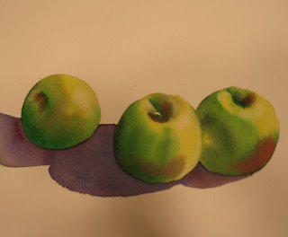
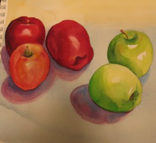
Three watercolors of apples, all sorts of apples. I think it's Roma, Delicious and Granny Smith. The trouble with these kinds of watercolors is the "background" or what to do with all that negative space behind and in front of your items, whatever they are. In these little studies, I have not done much of anything, but my professor suggested looking at the work of Charles Demuth, who did a sort of fade away drapery in some of his still lives. Worth a look. I think I'm most happy with the one above, the Romas, they had the most interesting markings, and I think the shadows work better than the other two below. The purple shadows seem too strong to me. The shadows in the Romas (the yellow and red apples) are more subtle, using a grey brown color, with a small touch of purple, just a touch.
And yes, I DO like using Picassa better, there is definitely more clarity in the photos.
Thanks much for stopping by.

 Ahhh, brown paper bags filled with flavored ground coffee; scoop up those nice fragrant beans and grind them into these cute little bags, a nice occasional treat. Usually it's whatever happens to be on sale at the Giant. But hey, I needed to draw brown paper bags anyway, right? French Vanilla and Chocolate Almond anyone? This one was done with pastel pencil on toned charcoal paper with a small spotlight to bring up some highlights. All the midtones are just the paper color. Worked out pretty well. Thanks for looking.
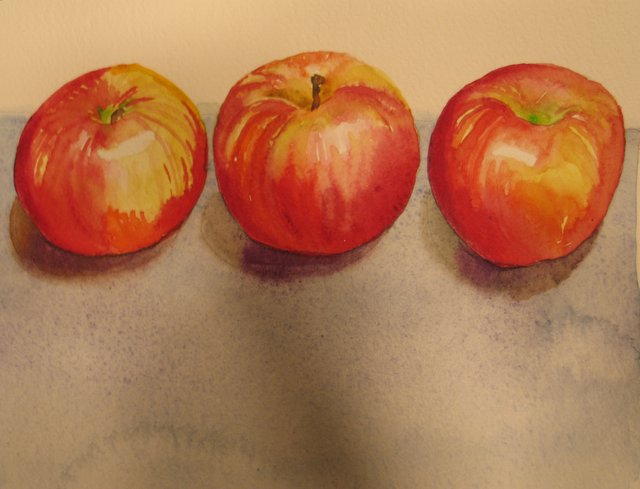


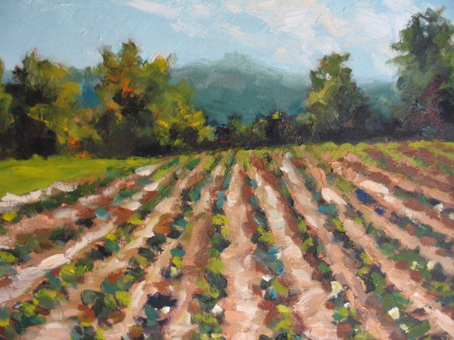

 This has been a gorgeous and longish fall for me, starting in Massachusetts and then enjoying the peak all over again in Maryland. Our November colors are so rich with wonderful grays and purples, deep beautiful browns and reds. The plein air class I'm taking has me frantic to paint, all I want is more time, more time, more time. Here are a couple of the oils I've been working on. There are a dozen more, all unfinished of course.